

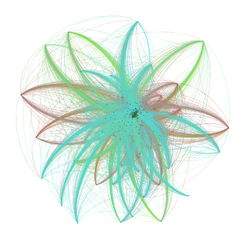
Kindred wondered, in a comment on my prior post how the trade network has evolved since 2000. Here is a quick reply that brings us up to 2006. These are two screenshots of the full global trade network. The left is the center of the starburst pictured on the right. Node size is weighted degree, or total imports. I enourage you to click this link and look at the full image, which is an SVG that allows you to zoom in and retain resolution. (And sorry, I did this quickly and labeled only the large nodes at the center). Data come from Barbieri. The network here is larger than the one I presented yesterday: 185 nodes. But, the trade network is not very dense: .39. This indicates a hierarchical rather than random or flat network structure, a conclusion supported by the starburst evident in the full visualization. I ran a community detection algorithm which identified the three groups reflected in the graph colors: the largest (tealish) centered on the US, which includes 50% of the nodes; a second European community (pea greenish) of about 34%, and a third composed of sub-Saharan African states (the rust colored group) about 13% of the nodes.
Hence, even by 2006, as the discussion of decoupling was beginning to emerge, we see no evidence of a regionalization of Asian trade that could provide a substitute for ties to the North American block.
Here is a version of the visualization that omits the community structure.


2 comments:
I confess to being a little perplexed here as to what these graphics actually show. If the central region includes the major economies, what are the termination nodes towards the edges?
@Rob. The graph includes approximately 185 countries. The nodes on the periphery are small low and middle income economies.
Post a Comment